Widgets
In this part of the Ruby GTK programming tutorial, we will introduce some widgets.Widgets are basic building blocks of a GUI application. Over the years, several widgets became a standard in all toolkits on all OS platforms. For example a button, a check box or a scroll bar. The GTK toolkit's philosophy is to keep the number of widgets at a minimum level. More specialized widgets are created as custom GTK widgets.
CheckButton
CheckButton is a widget, that has two states. On and Off. The On state is visualised by a check mark. It is used to denote some boolean property. #!/usr/bin/rubyWe will display a title in the titlebar of the window, depending on the state of the
# ZetCode Ruby GTK tutorial
#
# This program toggles the title of the
# window with the CheckButton widget
#
# author: jan bodnar
# website: www.zetcode.com
# last modified: April 2009
require 'gtk2'
class RubyApp < Gtk::Window
def initialize
super
set_title "CheckButton"
signal_connect "destroy" do
Gtk.main_quit
end
init_ui
set_default_size 250, 200
set_window_position Gtk::Window::POS_CENTER
show_all
end
def init_ui
fixed = Gtk::Fixed.new
add fixed
cb = Gtk::CheckButton.new "Show title"
cb.set_active true
cb.set_can_focus false
cb.signal_connect("clicked") do |w|
on_clicked(w)
end
fixed.put cb, 50, 50
end
def on_clicked sender
if sender.active?
    self.set_title "Check Button"
else
    self.set_title ""
end
end
end
Gtk.init
window = RubyApp.new
Gtk.main
CheckButton. cb = Gtk::CheckButton.new "Show title"
CheckButton widget is created. cb.set_active trueThe title is visible by default, so we check the check button by default.
if sender.active?We show the title, if the button is checked.
self.set_title "Check Button"
else
self.set_title ""
end
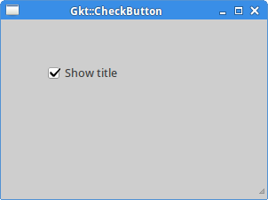
Figure: CheckButton
Label
TheLabel widget shows text. #!/usr/bin/rubyThe code example shows some lyrics on the window.
# ZetCode Ruby GTK tutorial
#
# This example demonstrates the Label widget
#
# author: jan bodnar
# website: www.zetcode.com
# last modified: June 2009
require 'gtk2'
$lyrics = %{Meet you downstairs in the bar and heard
your rolled up sleeves and your skull t-shirt
You say why did you do it with him today?
and sniff me out like I was Tanqueray
cause you're my fella, my guy
hand me your stella and fly
by the time I'm out the door
you tear men down like Roger Moore
I cheated myself
like I knew I would
I told ya, I was trouble
you know that I'm no good}
class RubyApp < Gtk::Window
def initialize
super
set_title "You know I'm no Good"
signal_connect "destroy" do
Gtk.main_quit
end
init_ui
set_default_size 250, 200
set_window_position Gtk::Window::POS_CENTER
show_all
end
def init_ui
set_border_width 10
label = Gtk::Label.new $lyrics
add label
end
end
Gtk.init
window = RubyApp.new
Gtk.main
 $lyrics = %{Meet you downstairs in the bar and heard
 your rolled up sleeves and your skull t-shirt
 ...
We create a multi line text. set_border_width 10The
Label is surrounded by some empty space. label = Gtk::Label.new $lyricsThe
add label
Label widget is created and added to the window. 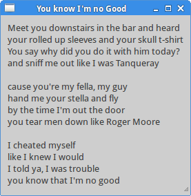
Figure: Label Widget
Entry
TheEntry is a single line text entry field. This widget is used to enter textual data. #!/usr/bin/rubyThis example shows an entry widget and a label. The text that we key in the entry is displayed immediately in the label widget.
# ZetCode Ruby GTK tutorial
#
# This example demonstrates the Entry widget
#
# author: jan bodnar
# website: www.zetcode.com
# last modified: June 2009
require 'gtk2'
class RubyApp < Gtk::Window
def initialize
super
set_title "Entry"
signal_connect "destroy" do
Gtk.main_quit
end
init_ui
set_default_size 250, 200
set_window_position Gtk::Window::POS_CENTER
show_all
end
def init_ui
fixed = Gtk::Fixed.new
label = Gtk::Label.new "..."
fixed.put label, 60, 40
entry = Gtk::Entry.new
fixed.put entry, 60, 100
entry.signal_connect "key-release-event" do |w, e|
    on_key_release(w, e, label)
end
add(fixed)
end
def on_key_release sender, event, label
    label.set_text sender.text
end
end
Gtk.init
window = RubyApp.new
Gtk.main
entry = Gtk::Entry.new
Entry widget is created. entry.signal_connect "key-release-event" do |w, e|We plug the
on_key_release(w, e, label)
end
on_key_release method to the key-release-event of the Entry widget. def on_key_release sender, event, labelWe get the text from the
label.set_text sender.text
end
Entry widget and set it to the label. 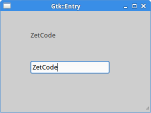
Figure: Entry Widget
Image
TheImage widget shows an image. #!/usr/bin/rubyIn our example, we show an image on the window.
# ZetCode Ruby GTK tutorial
#
# This example demonstrates the Image widget
#
# author: jan bodnar
# website: www.zetcode.com
# last modified: June 2009
require 'gtk2'
class RubyApp < Gtk::Window
def initialize
super
set_title "Red Rock"
signal_connect "destroy" do
Gtk.main_quit
end
init_ui
set_default_size 250, 200
set_window_position Gtk::Window::POS_CENTER
show_all
end
def init_ui
set_border_width 2
begin
    image = Gtk::Image.new "redrock.png"
rescue
    puts "cannot load image"
    exit
end
add image
end
end
Gtk.init
window = RubyApp.new
Gtk.main
set_border_width 2We put some empty border around the image.
beginThe
image = Gtk::Image.new "redrock.png"
rescue
puts "cannot load image"
exit
end
Image widget is created. IO operations are error prone, so we handle the possible exceptions. add imageWidget is added to the container.

Figure: Image widget
ComboBox
ComboBox is a widget that allows the user to choose from a list of options. #!/usr/bin/rubyThe example shows a combo box and a label. The combo box has a list of five options. These are the names of Linux Distros. The label widget shows the selected option from the combo box.
# ZetCode Ruby GTK tutorial
#
# This example demonstrates the ComboBox widget
#
# author: jan bodnar
# website: www.zetcode.com
# last modified: June 2009
require 'gtk2'
class RubyApp < Gtk::Window
def initialize
super
set_title "ComboBox"
signal_connect "destroy" do
Gtk.main_quit
end
init_ui
set_default_size 250, 200
set_window_position Gtk::Window::POS_CENTER
show_all
end
def init_ui
fixed = Gtk::Fixed.new
label = Gtk::Label.new '-'
fixed.put label, 50, 140
cb = Gtk::ComboBox.new
cb.signal_connect "changed" do |w, e|
on_changed(w, e, label)
end
cb.append_text 'Ubuntu'
cb.append_text 'Mandriva'
cb.append_text 'Redhat'
cb.append_text 'Gento'
cb.append_text 'Mint'
fixed.put cb, 50, 30
add fixed
end
def on_changed sender, event, label
    label.set_label sender.active_text
end
end
Gtk.init
window = RubyApp.new
Gtk.main
cb = Gtk::ComboBox.newThe
ComboBox widget is created. cb.append_text 'Ubuntu'It is filled with data.
cb.append_text 'Mandriva'
cb.append_text 'Redhat'
cb.append_text 'Gento'
cb.append_text 'Mint'
def on_changed sender, event, labelInside the
label.set_label sender.active_text
end
on_changed method, we get the selected text out of the combo box and set it to the label. 
Figure: ComboBox
In this chapter of the Ruby GTK tutorial, we showed some basic widgets. 
No comments:
Post a Comment