Widgets in GTK#
In this part of the GTK# programming tutorial, we will introduce some GTK# widgets.Widgets are basic building blocks of a GUI application. Over the years, several widgets became a standard in all toolkits on all OS platforms. For example a button, a check box or a scroll bar. The GTK# toolkit's philosophy is to keep the number of widgets at a minimum level. More specialized widgets are created as custom GTK# widgets.
Label
TheLabel widget shows text. label.cs
using Gtk;The code example shows some lyrics on the window.
class SharpApp : Window {
string text = @"Meet you downstairs in the bar and heard
your rolled up sleeves and your skull t-shirt
You say why did you do it with him today?
and sniff me out like I was Tanqueray
cause you're my fella, my guy
hand me your stella and fly
by the time I'm out the door
you tear men down like Roger Moore
I cheated myself
like I knew I would
I told ya, I was trouble
you know that I'm no good";
public SharpApp() : base("You know I'm No Good")
{
BorderWidth = 8;
SetPosition(WindowPosition.Center);
DeleteEvent += delegate { Application.Quit(); };
Label lyrics = new Label(text);
Add(lyrics);
ShowAll();
}
public static void Main()
{
Application.Init();
new SharpApp();
Application.Run();
}
}
string text = @"Meet you downstairs in the bar and heardIn C# programming language, multiline string is preceded with the @ character.
your rolled up sleeves and your skull t-shirt
...
BorderWidth = 8;The
Label is surrounded by some empty space. Label lyrics = new Label(text);The
Add(lyrics);
Label widget is created and added to the window. 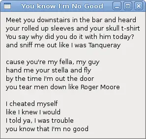
Figure: Label Widget
CheckButton
CheckButton is a widget, that has two states. On and Off. The On state is visualised by a check mark. It is used to denote some boolean property. checkbutton.cs
using Gtk;We will display a title in the titlebar of the window, depending on the state of the
using System;
class SharpApp : Window {
public SharpApp() : base("CheckButton")
{
SetDefaultSize(250, 200);
SetPosition(WindowPosition.Center);
DeleteEvent += delegate { Application.Quit(); };
CheckButton cb = new CheckButton("Show title");
cb.Active = true;
cb.Toggled += OnToggle;
Fixed fix = new Fixed();
fix.Put(cb, 50, 50);
Add(fix);
ShowAll();
}
void OnToggle(object sender, EventArgs args)
{
CheckButton cb = (CheckButton) sender;
if (cb.Active) {
    Title = "CheckButton";
} else {
    Title = " ";
}
}
public static void Main()
{
Application.Init();
new SharpApp();
Application.Run();
}
}
CheckButton. CheckButton cb = new CheckButton("Show title");
CheckButton widget is created. cb.Active = true;The title is visible by default, so we check the check button by default.
CheckButton cb = (CheckButton) sender;Here we cast the sender object to
CheckButton class. if (cb.Active) {
Title = "CheckButton";
} else {
Title = " ";
}
Depending on the Active property of the CheckButton, we show or hide the title of the window. 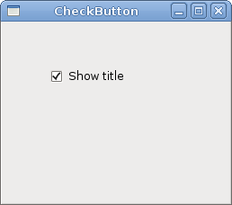
Figure: CheckButton
ComboBox
ComboBox is a widget that allows the user to choose from a list of options. combobox.cs
using Gtk;The example shows a combo box and a label. The combo box has a list of six options. These are the names of Linux Distros. The label widget shows the selected option from the combo box.
using System;
class SharpApp : Window {
Label label;
public SharpApp() : base("ComboBox")
{
string[] distros = new string[] {"Ubuntu",
    "Mandriva",
    "Red Hat",
    "Fedora",
    "Gentoo" };
SetDefaultSize(250, 200);
SetPosition(WindowPosition.Center);
BorderWidth = 7;
DeleteEvent += delegate { Application.Quit(); };
Fixed fix = new Fixed();
ComboBox cb = new ComboBox(distros);
cb.Changed += OnChanged;
label = new Label("-");
fix.Put(cb, 50, 30);
fix.Put(label, 50, 140);
Add(fix);
ShowAll();
}
void OnChanged(object sender, EventArgs args)
{
    ComboBox cb = (ComboBox) sender;
    label.Text = cb.ActiveText;
}
public static void Main()
{
Application.Init();
new SharpApp();
Application.Run();
}
}
string[] distros = new string[] {"Ubuntu",
"Mandriva",
"Red Hat",
"Fedora",
"Gentoo" };
This is an array of strings, that will be shown in the ComboBox widget. ComboBox cb = new ComboBox(distros);The
ComboBox widget is created. The constructor takes the array of strings as a parameter. void OnChanged(object sender, EventArgs args)Inside the
{
ComboBox cb = (ComboBox) sender;
label.Text = cb.ActiveText;
}
OnChanged() method, we get the selected text out of the combo box and set it to the label. 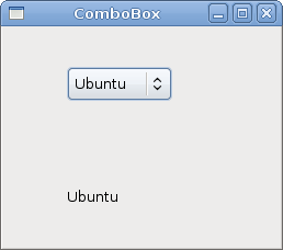
Figure: ComboBox
Image
The next example introduces theImage widget. This widget displays pictures. image.cs
using Gtk;We show the Red Rock castle in the window.
using System;
class SharpApp : Window {
Gdk.Pixbuf castle;
public SharpApp() : base("Red Rock")
{
BorderWidth = 1;
SetPosition(WindowPosition.Center);
DeleteEvent += delegate { Application.Quit(); };
 try {
     castle = new Gdk.Pixbuf("redrock.png");
 } catch {
     Console.WriteLine("Image not found");
     Environment.Exit(1);
 }
Image image = new Image(castle);
Add(image);
ShowAll();
}
public static void Main()
{
Application.Init();
new SharpApp();
Application.Run();
}
}
try {
castle = new Gdk.Pixbuf("redrock.png");
} catch {
Console.WriteLine("Image not found");
Environment.Exit(1);
}
We create the Gdk.Pixbuf widget. We put the constructor between the try/catch keywords to handle possible errors. Image image = new Image(castle);
Add(image);
Image widget is created and added to the window. 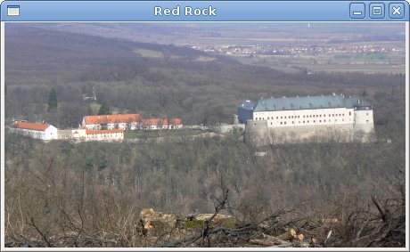
Figure: Image
In this chapter, we showed the first pack of basic widgets of the GTK# programming library. 
No comments:
Post a Comment