Widgets in QtJambi
In this part of the QtJambi programming tutorial, we will cover QtJambi widgets.Widgets are basic building blocks of a GUI application. Over the years, several widgets became a standard in all toolkits on all OS platforms. For example a button, a check box or a scroll bar. QtJambi has a rich set of widgets which cover most of the programming needs. More specialized widgets can be created as custom widgets.
QCheckBox
The QCheckBox is a widget, that has two states. On and Off. The On state is visualized by a check mark. It is used to denote some boolean property. The QCheckBox widget provides a checkbox with a text label.package com.zetcode;In our example, we place a check box on the window. The check box shows/hides the title of the window.
import com.trolltech.qt.core.Qt.FocusPolicy;
import com.trolltech.qt.gui.QApplication;
import com.trolltech.qt.gui.QCheckBox;
import com.trolltech.qt.gui.QWidget;
/**
* ZetCode QtJambi tutorial
*
* This program uses QCheckBox
* widget to show/hide the title
* of the window
*
* @author jan bodnar
* website zetcode.com
* last modified March 2009
*/
public class JambiApp extends QWidget {
public JambiApp() {
setWindowTitle("QCheckBox");
initUI();
resize(250, 150);
move(300, 300);
show();
}
public void initUI() {
QCheckBox cb = new QCheckBox("Show Title", this);
cb.setFocusPolicy(FocusPolicy.NoFocus);
cb.setChecked(true);
cb.toggled.connect(this, "onChanged(boolean)");
cb.move(50, 50);
}
public void onChanged(boolean state) {
if (state) {
    setWindowTitle("QCheckBox");
} else {
    setWindowTitle("");
}
}
public static void main(String[] args) {
QApplication.initialize(args);
new JambiApp();
QApplication.exec();
}
}
setWindowTitle("QCheckBox");
During the construction of the window, we set a title for the window. QCheckBox cb = new QCheckBox("Show Title", this);
The QCheckBox widget is created. The first parameter of the constructor is its text label. The second parameter is the parent widget. cb.setFocusPolicy(FocusPolicy.NoFocus);I do not like the visual representation of a focused check box. This line disables focus.
cb.setChecked(true);The title is visible at the start of the application. So the check box must be checked too.
cb.toggled.connect(this, "onChanged(boolean)");The toggled() signal is emitted when the state of a check box changes. When the signal is emitted, we trigger the onChanged() method.
if (state) {
setWindowTitle("QCheckBox");
} else {
setWindowTitle("");
}
Depending on the state of the check box, we show or hide the title of the window. 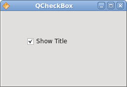
Figure: QCheckBox
QLabel
The QLabel widget is used to display text or image. No user interaction is available.package com.zetcode;Our example shows lyrics of a song in the window.
import com.trolltech.qt.gui.QApplication;
import com.trolltech.qt.gui.QFont;
import com.trolltech.qt.gui.QLabel;
import com.trolltech.qt.gui.QVBoxLayout;
import com.trolltech.qt.gui.QWidget;
/**
* ZetCode QtJambi tutorial
*
* This program uses QLabel to
* show lyrics of a song
*
* @author jan bodnar
* website zetcode.com
* last modified March 2009
*/
public class JambiApp extends QWidget {
public JambiApp() {
setWindowTitle("You know I'm no Good");
initUI();
move(300, 300);
show();
}
private void initUI() {
String text =
"Meet you downstairs in the bar and heard\n" +
"your rolled up sleeves and your skull t-shirt\n" +
"You say why did you do it with him today?\n" +
"and sniff me out like I was Tanqueray\n\n" +
"cause you're my fella, my guy\n" +
"hand me your stella and fly\n" +
"by the time I'm out the door\n" +
"you tear men down like Roger Moore\n\n" +
"I cheated myself\n" +
"like I knew I would\n" +
"I told ya, I was trouble\n" +
"you know that I'm no good";
QLabel label = new QLabel(text, this);
label.setFont(new QFont("Purisa", 9));
QVBoxLayout vbox = new QVBoxLayout();
vbox.addWidget(label);
setLayout(vbox);
}
public static void main(String[] args) {
QApplication.initialize(args);
new JambiApp();
QApplication.exec();
}
}
String text =We define a multi line text.
"Meet you downstairs in the bar and heard\n" +
...
QLabel label = new QLabel(text, this);We create the label widget and change its font.
label.setFont(new QFont("Purisa", 9));
QVBoxLayout vbox = new QVBoxLayout();Instead of manually coding the position and size of the label, we put the label into a box layout.
vbox.addWidget(label);
setLayout(vbox);
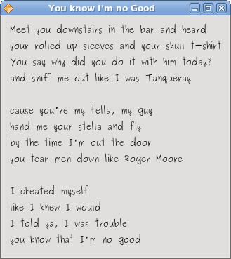
Figure: QLabel
QLineEdit
The QLineEdit is a widget that allows to enter and edit a single line of plain text. There are undo/redo, cut/paste and drag & drop functions available for QLineEdit widget.package com.zetcode;In our example we show two widgets. A line edit and a label widget. The text entered into the line edit is shown in the label widget.
import com.trolltech.qt.gui.QApplication;
import com.trolltech.qt.gui.QLabel;
import com.trolltech.qt.gui.QLineEdit;
import com.trolltech.qt.gui.QWidget;
/**
* ZetCode QtJambi tutorial
*
* This program shows text
* which is entered in a QLineEdit
* widget in a QLabel widget
*
* @author jan bodnar
* website zetcode.com
* last modified March 2009
*/
public class JambiApp extends QWidget {
QLabel label;
public JambiApp() {
setWindowTitle("QLineEdit");
initUI();
resize(250, 200);
move(300, 300);
show();
}
private void initUI() {
label = new QLabel(this);
QLineEdit edit = new QLineEdit(this);
edit.textChanged.connect(this, "onChanged(String)");
edit.move(60, 100);
label.move(60, 40);
}
private void onChanged(String text) {
    label.setText(text);
    label.adjustSize();
}
public static void main(String[] args) {
QApplication.initialize(args);
new JambiApp();
QApplication.exec();
}
}
QLineEdit edit = new QLineEdit(this);The QLineEdit widget is created.
edit.textChanged.connect(this, "onChanged(String)");When we type or delete some text from the line edit, the onChanged()method is triggered.
private void onChanged(String text) {
label.setText(text);
label.adjustSize();
}
In the onChanged() method, we set the contents of the line edit to the label widget. The adjustSize() method ensures, that all text is visible. 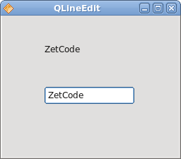
Figure: QLineEdit widget
Toggle buttons
Toggle buttons are push buttons with a checkable flag set. Toggle button is a button that has two states. Pressed and not pressed. You toggle between these two states by clicking on it. There are situations where this functionality fits well.package com.zetcode;In the code example, we use three toggle buttons to change the color of a rectangular widget.
import com.trolltech.qt.gui.QApplication;
import com.trolltech.qt.gui.QColor;
import com.trolltech.qt.gui.QPushButton;
import com.trolltech.qt.gui.QWidget;
import java.util.Formatter;
/**
* ZetCode QtJambi tutorial
*
* This program uses toggle buttons to
* change the background color of
* a widget
*
* @author jan bodnar
* website zetcode.com
* last modified March 2009
*/
public class JambiApp extends QWidget {
private QWidget square;
private QColor color;

private QPushButton redb;
private QPushButton greenb;
private QPushButton blueb;
public JambiApp() {
setWindowTitle("Toggle Buttons");
initUI();
resize(350, 240);
move(300, 300);
show();
}
private void initUI() {
color = new QColor();
redb = new QPushButton("Red", this);
redb.setCheckable(true);
greenb = new QPushButton("Green", this);
greenb.setCheckable(true);
blueb = new QPushButton("Blue", this);
blueb.setCheckable(true);
redb.toggled.connect(this, "onToggled()");
greenb.toggled.connect(this, "onToggled()");
blueb.toggled.connect(this, "onToggled()");
square = new QWidget(this);
square.setStyleSheet("QWidget { background-color: black }");
redb.move(30, 30);
greenb.move(30, 80);
blueb.move(30, 130);
square.setGeometry(150, 25, 150, 150);
}
public void onToggled() {
int red = color.red();
int green = color.green();
int blue = color.blue();
if (redb.isChecked()) {
    red = 255;
} else {
    red = 0;
}
if (greenb.isChecked()) {
green = 255;
} else {
green = 0;
}
if (blueb.isChecked()) {
blue = 255;
} else {
blue = 0;
}
color = new QColor(red, green, blue);
Formatter fmt = new Formatter();
fmt.format("QWidget { background-color: %s }", color.name());
square.setStyleSheet(fmt.toString());
}
public static void main(String[] args) {
QApplication.initialize(args);
new JambiApp();
QApplication.exec();
}
}
private QWidget square;We define five objects. The square widget is a QWidget, which shows the color. The color variable is used to hold the color value. The three buttons are toggle buttons, which are used to mix the color value.
private QColor color;
private QPushButton redb;
private QPushButton greenb;
private QPushButton blueb;
redb = new QPushButton("Red", this);
redb.setCheckable(true);
We create a QPushButton widget. The setCheckable() method changes the push button into a toggle button. redb.toggled.connect(this, "onToggled()");All three buttons are plugged into one method call, the onToggled() method.
greenb.toggled.connect(this, "onToggled()");
blueb.toggled.connect(this, "onToggled()");
square = new QWidget(this);We create the square widget. At the beginning, it is black. In QtJambi, we use style sheets to customize the appearance of a widget.
square.setStyleSheet("QWidget { background-color: black }");
Inside the onToggled() method, we determine the color value and update the square widget to a new color.
int red = color.red();Here we determine the current color of the square widget.
int green = color.green();
int blue = color.blue();
if (redb.isChecked()) {
red = 255;
} else {
red = 0;
}
Change the red part of the color, depending on the state of the red toggle button. color = new QColor(red, green, blue);We create a new color value.
Formatter fmt = new Formatter();These two lines create the text for the style sheet. We use the Java Formatter object.
fmt.format("QWidget { background-color: %s }", color.name());
square.setStyleSheet(fmt.toString());The color of the square is updated.
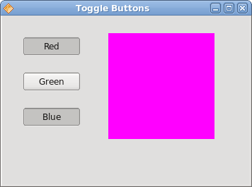
Figure: Toggle buttons
QComboBox
The QComboBox is a widget that allows the user to choose from a list of options. It is a selection widget that displays the current item, and can pop up a list of selectable items. A combo box may be editable. It presents a list of options to the user in a way that takes up the minimum amount of screen space.package com.zetcode;In our code example, we have two widgets. A combo box and a label widget. The option selected from a combo box is shown in the label.
import com.trolltech.qt.gui.QApplication;
import com.trolltech.qt.gui.QComboBox;
import com.trolltech.qt.gui.QLabel;
import com.trolltech.qt.gui.QWidget;
/**
* ZetCode QtJambi tutorial
*
* This program uses the QComboBox widget.
* The option selected from the combo box is
* displayed in the label widget.
*
* @author jan bodnar
* website zetcode.com
* last modified March 2009
*/
public class JambiApp extends QWidget {
QLabel label;
public JambiApp() {
setWindowTitle("QComboBox");
initUI();
resize(250, 200);
move(300, 300);
show();
}
private void initUI() {
label = new QLabel("Ubuntu", this);
QComboBox combo = new QComboBox(this);
combo.addItem("Ubuntu");
combo.addItem("Fedora");
combo.addItem("Mandriva");
combo.addItem("Red Hat");
combo.addItem("Mint");
combo.currentStringChanged.connect(this, "OnActivated(String)");
combo.move(50, 30);
label.move(50, 100);
}
private void OnActivated(String text) {
    label.setText(text);
    label.adjustSize();
}
public static void main(String[] args) {
QApplication.initialize(args);
new JambiApp();
QApplication.exec();
}
}
label = new QLabel("Ubuntu", this);
This is the label, that will show the currently selected option from the combo box. QComboBox combo = new QComboBox(this);We create the instance of the QComboBox widget.
combo.addItem("Ubuntu");
combo.addItem("Fedora");
combo.addItem("Mandriva");
combo.addItem("Red Hat");
combo.addItem("Mint");
Combo box is filled with values. combo.currentStringChanged.connect(this, "OnActivated(String)");When we select an option from the combo box, the OnActivated() method is triggered.
private void OnActivated(String text) {
label.setText(text);
label.adjustSize();
}
In the OnActivated() method, we update the label widget to the currently selected string from the combo box. 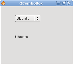
Figure: QComboBox widget
In this part of the QtJambi tutorial, we have presented several QtJambi widgets. 
No comments:
Post a Comment