Layout management in Tkinter
In this part of the Tkinter programming tutorial, we will introduce layout managers.When we design the GUI of our application, we decide what widgets we will use and how we will organize those widgets in the application. To organize our widgets, we use specialized non visible objects called layout managers.
There are two kinds of widgets. Containers and their children. The containers group their children into suitable layouts.
Tkinter has three built-in layout managers. The pack, grid and place managers. The pack geometry manager organizes widgets in vertical and horizontal boxes. The grid geometry managers places widgets in a two dimensional grid. Finally, the place geometry manager places widgets on their containers using absolute positioning.
Absolute positioning
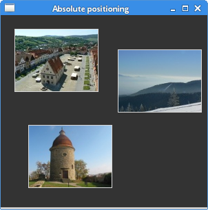
In most cases, programmers should use layout managers. There are a few situations, where we can use absolute positioning. In absolute positioning, the programmer specifies the position and the size of each widget in pixels. The size and the position of a widget do not change, if you resize a window. Applications look different on various platforms, and what looks OK on Linux, might not look OK on Mac. Changing fonts in your application might spoil the layout. If you translate your application into another language, you must redo your layout.#!/usr/bin/pythonIn this example, we place three images using absolute positioning. We will use the place geometry manager.
# -*- coding: utf-8 -*-
"""
ZetCode Tkinter tutorial
In this script, we lay out images
using absolute positioning.
author: Jan Bodnar
last modified: December 2010
website: www.zetcode.com
"""
from PIL import Image, ImageTk
from Tkinter import Tk, Label, BOTH
from ttk import Frame, Style
class Example(Frame):
def __init__(self, parent):
Frame.__init__(self, parent)
self.parent = parent
self.initUI()
def initUI(self):
self.parent.title("Absolute positioning")
self.pack(fill=BOTH, expand=1)
Style().configure("TFrame", background="#333")
bard = Image.open("bardejov.jpg")
bardejov = ImageTk.PhotoImage(bard)
label1 = Label(self, image=bardejov)
label1.image = bardejov
label1.place(x=20, y=20)
rot = Image.open("rotunda.jpg")
rotunda = ImageTk.PhotoImage(rot)
label2 = Label(self, image=rotunda)
label2.image = rotunda
label2.place(x=40, y=160)
minc = Image.open("mincol.jpg")
mincol = ImageTk.PhotoImage(minc)
label3 = Label(self, image=mincol)
label3.image = mincol
label3.place(x=170, y=50)
def main():
root = Tk()
root.geometry("300x280+300+300")
app = Example(root)
root.mainloop()
if __name__ == '__main__':
main()
from PIL import Image, ImageTkWe will use
Image and ImageTk from the Python Imaging Library (PIL) module. Style().configure("TFrame", background="#333")
We configure our frame to have a dark gray background using styles. bard = Image.open("bardejov.jpg")
bardejov = ImageTk.PhotoImage(bard)
We create an image object and a photo image object from an image in the current working directory. label1 = Label(self, image=bardejov)We create a
Label with an image. Labels can contain text or images. label1.image = bardejovWe must keep the reference to the image to prevent image from being garbage collected.
label1.place(x=20, y=20)The label is placed on the frame at x=20, y=20 coordinates.

Figure: Absolute positioning
Buttons example
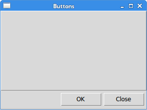
In the following example, we will position two buttons in the bottom right corner of the window. We will use the pack manager.#!/usr/bin/pythonWe will have two frames. There is the base frame and an additional frame, which will expand in both directions and push the two buttons to the bottom of the base frame. The buttons are placed in a horizontal box and placed to the right of this box.
# -*- coding: utf-8 -*-
"""
ZetCode Tkinter tutorial
In this script, we use pack manager
to position two buttons in the
bottom right corner of the window.
author: Jan Bodnar
last modified: December 2010
website: www.zetcode.com
"""
from Tkinter import Tk, RIGHT, BOTH, RAISED
from ttk import Frame, Button, Style
class Example(Frame):
def __init__(self, parent):
Frame.__init__(self, parent)
self.parent = parent
self.initUI()
def initUI(self):
self.parent.title("Buttons")
self.style = Style()
self.style.theme_use("default")
frame = Frame(self, relief=RAISED, borderwidth=1)
frame.pack(fill=BOTH, expand=1)
self.pack(fill=BOTH, expand=1)
closeButton = Button(self, text="Close")
closeButton.pack(side=RIGHT, padx=5, pady=5)
okButton = Button(self, text="OK")
okButton.pack(side=RIGHT)
def main():
root = Tk()
root.geometry("300x200+300+300")
app = Example(root)
root.mainloop()
if __name__ == '__main__':
main()
frame = Frame(self, relief=RAISED, borderwidth=1)We create another
frame.pack(fill=BOTH, expand=1)
Frame widget. This widget takes the bulk of the area. We change the border of the frame so that the frame is visible. By default it is flat. closeButton = Button(self, text="Close")A closeButton is created. It is put into a horizontal box. The
closeButton.pack(side=RIGHT, padx=5, pady=5)
side parameter will create a horizontal box layout, in which the button is placed to the right of the box. The padxand the pady parameters will put some space between the widgets. The padx puts some space between the button widgets and between the closeButton and the right border of the root window. The pady puts some space between the button widgets and the borders of the frame and the root window. okButton.pack(side=RIGHT)The okButton is placed next to the closeButton. With 5px space between them.

Figure: Buttons example
Calculator
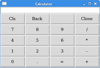
We will use a Tkinter grid geometry manager to create a skeleton of a calculator.#!/usr/bin/pythonThe grid manager is used to organize buttons in the frame container widget.
# -*- coding: utf-8 -*-
"""
ZetCode Tkinter tutorial
In this script, we use the grid manager
to create a skeleton of a calculator.
author: Jan Bodnar
last modified: December 2010
website: www.zetcode.com
"""
from Tkinter import Tk, W, E
from ttk import Frame, Button, Label, Style
from ttk import Entry
class Example(Frame):
def __init__(self, parent):
Frame.__init__(self, parent)
self.parent = parent
self.initUI()
def initUI(self):
self.parent.title("Calculator")
Style().configure("TButton", padding=(0, 5, 0, 5),
    font='serif 10')
self.columnconfigure(0, pad=3)
self.columnconfigure(1, pad=3)
self.columnconfigure(2, pad=3)
self.columnconfigure(3, pad=3)
self.rowconfigure(0, pad=3)
self.rowconfigure(1, pad=3)
self.rowconfigure(2, pad=3)
self.rowconfigure(3, pad=3)
self.rowconfigure(4, pad=3)
entry = Entry(self)
entry.grid(row=0, columnspan=4, sticky=W+E)
cls = Button(self, text="Cls")
        cls.grid(row=1, column=0)
bck = Button(self, text="Back")
bck.grid(row=1, column=1)
lbl = Button(self)
lbl.grid(row=1, column=2)
clo = Button(self, text="Close")
clo.grid(row=1, column=3)
sev = Button(self, text="7")
sev.grid(row=2, column=0)
eig = Button(self, text="8")
eig.grid(row=2, column=1)
nin = Button(self, text="9")
nin.grid(row=2, column=2)
div = Button(self, text="/")
div.grid(row=2, column=3)
fou = Button(self, text="4")
fou.grid(row=3, column=0)
fiv = Button(self, text="5")
fiv.grid(row=3, column=1)
six = Button(self, text="6")
six.grid(row=3, column=2)
mul = Button(self, text="*")
mul.grid(row=3, column=3)
one = Button(self, text="1")
one.grid(row=4, column=0)
two = Button(self, text="2")
two.grid(row=4, column=1)
thr = Button(self, text="3")
thr.grid(row=4, column=2)
mns = Button(self, text="-")
mns.grid(row=4, column=3)
zer = Button(self, text="0")
zer.grid(row=5, column=0)
dot = Button(self, text=".")
dot.grid(row=5, column=1)
equ = Button(self, text="=")
equ.grid(row=5, column=2)
pls = Button(self, text="+")
pls.grid(row=5, column=3)
self.pack()
def main():
root = Tk()
app = Example(root)
root.mainloop()
if __name__ == '__main__':
main()
Style().configure("TButton", padding=(0, 5, 0, 5),
font='serif 10')
We configure the Button widget to have a specific font and to have some internal padding. self.columnconfigure(0, pad=3)We use the
...
self.rowconfigure(0, pad=3)
columnconfigure() and the rowconfigure()methods to define some space in grid columns and rows. This way we achieve that the buttons are separated by some space. entry = Entry(self)The
entry.grid(row=0, columnspan=4, sticky=W+E)
Entry widget is where the digits are displayed. The widget is placed at the first row and it will span all four columns. Widgets may not occupy all the space allotted by cells in the grid. The stickyparameter will expand the widget in a given direction. In our case, we ensure, that the entry widget is expanded from left to the right. cls = Button(self, text="Cls")The cls button is placed at the second row, first column. Note that the rows and columns start at zero.
cls.grid(row=1, column=0)
self.pack()The
pack() method shows the frame widget and gives it initial size. If no other parameters are given, the size will be just enough to show all children. This method packs the frame widget to the toplevel root window, which is also a container. The grid geometry manager is used to organize buttons in the frame widget. 
Figure: Calculator
Windows example
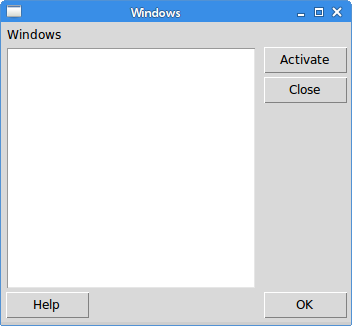
The following example creates the windows dialog using the grid geometry manager. The dialog comes from the JDeveloper application.#!/usr/bin/pythonIn this example, we will use a
# -*- coding: utf-8 -*-
"""
ZetCode Tkinter tutorial
In this script, we use the grid
manager to create a more complicated
layout.
author: Jan Bodnar
last modified: December 2010
website: www.zetcode.com
"""
from Tkinter import Tk, Text, BOTH, W, N, E, S
from ttk import Frame, Button, Label, Style
class Example(Frame):
def __init__(self, parent):
Frame.__init__(self, parent)
self.parent = parent
self.initUI()
def initUI(self):
self.parent.title("Windows")
self.style = Style()
self.style.theme_use("default")
self.pack(fill=BOTH, expand=1)
self.columnconfigure(1, weight=1)
self.columnconfigure(3, pad=7)
self.rowconfigure(3, weight=1)
self.rowconfigure(5, pad=7)
lbl = Label(self, text="Windows")
lbl.grid(sticky=W, pady=4, padx=5)
area = Text(self)
area.grid(row=1, column=0, columnspan=2, rowspan=4,
    padx=5, sticky=E+W+S+N)
abtn = Button(self, text="Activate")
abtn.grid(row=1, column=3)
cbtn = Button(self, text="Close")
cbtn.grid(row=2, column=3, pady=4)
hbtn = Button(self, text="Help")
hbtn.grid(row=5, column=0, padx=5)
obtn = Button(self, text="OK")
obtn.grid(row=5, column=3)
def main():
root = Tk()
root.geometry("350x300+300+300")
app = Example(root)
root.mainloop()
if __name__ == '__main__':
main()
Label widget, a Text widget and four buttons. self.columnconfigure(1, weight=1)We define some spaces among widgets in the grid. The largest space is put between the
self.columnconfigure(3, pad=7)
self.rowconfigure(3, weight=1)
self.rowconfigure(5, pad=7)
Text widget and the buttons. lbl = Label(self, text="Windows")The label widget is created and put into the grid. If no column and row is specified, then the first column/row is assumed. The label sticks to west and it has some padding around its text.
lbl.grid(sticky=W, pady=4, padx=5)
area = Text(self)The
area.grid(row=1, column=0, columnspan=2, rowspan=4,
padx=5, sticky=E+W+S+N)
Text widget is created and starts from the second row, first column. It spans 2 columns and 4 rows. There is 4px space between the widget and the left border of the root window. Finally, it sticks to all the four sides. So when the window is resized, the Text widget grows in all directions. 
Figure: Windows example
In this part of the Tkinter tutorial, we mentioned layout management of widgets.
No comments:
Post a Comment